Thursday 31 January 2013
Changes to the Titles
Yesterday, some changes to the titles was endured in the process of putting the titles on to the final edit for the main reasons; one being that the word didn’t grammatically make sense or because the original placing didn’t make the work cohesive. In terms of the changes, Justified them to everyone and asked if the agreed. Below is a screenshot in which was the planned titles anything In red with an explanation was changed in the process of applying the titles yesterday.

Wednesday 30 January 2013
Titles and Transitions
 Today, we actually started to add the transitions and the
titles for the opening title sequence which I am really happy about as, it
finally means that we can get an actual overall idea of what the sequence is
going to look like overall rather than just the edit by itself, it also gave me
and Daisy a real chance to put our ides into the edit which I was really
enthused about as it is the concept of something new. The screen shot on the
left shows that I started to add the fonts, following will be the process in which
was endured for this process.
Today, we actually started to add the transitions and the
titles for the opening title sequence which I am really happy about as, it
finally means that we can get an actual overall idea of what the sequence is
going to look like overall rather than just the edit by itself, it also gave me
and Daisy a real chance to put our ides into the edit which I was really
enthused about as it is the concept of something new. The screen shot on the
left shows that I started to add the fonts, following will be the process in which
was endured for this process. This is actually the first step which we was helped with by
Jack as we asked Jack how to do the proceed conducting it in a certain manner
and Jack told us, we made notes meaning we could do it ourselves when we
started. To get to this screenshot you basically, open a bottom make A and then
from this there is a drop down menu which you would click text and test again
to start adding the text. This step was rather easy to get to as it is accessible
and the buttons be seen clearly as they are bold.
This is actually the first step which we was helped with by
Jack as we asked Jack how to do the proceed conducting it in a certain manner
and Jack told us, we made notes meaning we could do it ourselves when we
started. To get to this screenshot you basically, open a bottom make A and then
from this there is a drop down menu which you would click text and test again
to start adding the text. This step was rather easy to get to as it is accessible
and the buttons be seen clearly as they are bold.
This screenshot shows one of the windows in which will occur after the technique of the first step. It here allows you type the text in which needs to appear on the frame making it very manageable by the person in control on the mouse. There is also other techniques within this window in which you can control and this includes changing the size in which I did a lot to get the right sizing and the sizing of the font was for the smaller credits it was 27 and for the larger credits and basically it was the main titles which was 48. Therefore, this helps to emphasise that the most important thing is the main titles. You, can also like we did change the colours of the fonts meaning that there is a colour spectrum but this was rather easy as we already as a group decided that the white was our number one preference.
 This screenshot shows here how you can move the font and
therefore pick a placement of the font. To be honest Daisy picked the placement
which was absolutely, fine as we worked as a team us me doing the fonts and Daisy
the movement of the fonts onto the screen as I applied the positioning of the
fonts. To move the fonts you have to make sure that you have the x framing on
the font and to move you click on the middle and move the font within the
frame. This was rather easy to move but at stages there was complications as
the x frame sometimes was not clicked.
This screenshot shows here how you can move the font and
therefore pick a placement of the font. To be honest Daisy picked the placement
which was absolutely, fine as we worked as a team us me doing the fonts and Daisy
the movement of the fonts onto the screen as I applied the positioning of the
fonts. To move the fonts you have to make sure that you have the x framing on
the font and to move you click on the middle and move the font within the
frame. This was rather easy to move but at stages there was complications as
the x frame sometimes was not clicked.
The most annoying and time consuming part about the opening title sequence and the adding the titles was having to render practically after every piece of movement and new effect added which did become rather frustrating at times as it meant that what we could have done in an hour and a half turn into two and a half hours.

This screen shot is showing basically that I prior before moving the fonts and doing the placement and size, I made them as it meant that I could then do lots of fonts consecutively meaning they would all work well together and also meaning that in one run I could get it done as I would be following the same process.
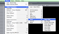 This is the start of the transitions in which Daisy
completed and this was more of a trial and improvement type of steps and Daisy
thoughoully analysed each type of effect seeing if it actually worked alongside
all of the opening title sequences that already existed. To do this it was
basically a matter of clicking on the effects on the main bar at the top and
then under transitions on video Daisy chose to pick one in which was branded
Band Slide which was a transition in which was a slide across the screen
looking really much like the analysed ones in which we looked at thus
replicating our genre very well thereof ea. think it fits the conventions of
the genre.
This is the start of the transitions in which Daisy
completed and this was more of a trial and improvement type of steps and Daisy
thoughoully analysed each type of effect seeing if it actually worked alongside
all of the opening title sequences that already existed. To do this it was
basically a matter of clicking on the effects on the main bar at the top and
then under transitions on video Daisy chose to pick one in which was branded
Band Slide which was a transition in which was a slide across the screen
looking really much like the analysed ones in which we looked at thus
replicating our genre very well thereof ea. think it fits the conventions of
the genre.
This is the last sort of transitions and these were only applied to the smaller titles as the band slide appeared on the main titles. Personally, I feel that it was a good idea to do a transition of both of the fonts as with one it looked rather odd as if one font was supposed to stay. The use of the cross dissolve gave this sophistic approach to the tieless thus making it look far more professional therefore, it could be considered and referred to as being more of an existing opening title sequence in the film industry.
New filming.Journal:30/01/12
 Today, we completed a new scene to add to the new edit ads
we needed to a degree to fill a certain amount of filming with a sub merged
image as, it started towards the end get slightly boring and un-interactive, it
would also give us the opportunity to start adding the fighting for safety of
the world element and aspect which is evident in the genre of, action,
adventure and spy.
Today, we completed a new scene to add to the new edit ads
we needed to a degree to fill a certain amount of filming with a sub merged
image as, it started towards the end get slightly boring and un-interactive, it
would also give us the opportunity to start adding the fighting for safety of
the world element and aspect which is evident in the genre of, action,
adventure and spy.
The footage was rather hard to shoot as we picked a corridor
at school and it being early in the morning meant that kids was appearing for
tutor time thus meaning that we had to move a lot but, luckily we found a
corridor which was quiet and only available to a limited amount of people;
becoming the perfect space for filming. The scene didn’t really need that much
structure as we knew the scene needed to be an extreme long shot of me, Mr
Teddy fighting the bad.
This was then added to the new edit and really worked well
at connoting this element of saving the day in a humours way as the acting was
rather unstructured thus looking like a joke which we wanted to produce. For
the main reason that a full on fight scene in which people are hurt would be
more likely to appear in an older buff rating.
The filming was done by daisy and in my opinion, although I
am bias I think it has been done very well as the lighting works clearly and
the enhancing of the bodies works really well. I also think that the
positioning of the camera was a good imitative as, it meant that we could see
the door from an angle as well as see me walk in properly as the door on the
right was the only one in which you could are outside.
Tuesday 29 January 2013
Journal
Sadly, today was the pinnacle of disruption to our opening
title sequence as our footage when all put together by Louise just didn't have
the sense of fluid transition in which I suppose we all intended it to have. I
would like to take some of the blame in this event as my main role was to keep
continuity which sadly I did not completely achieve. I personally feel the
continuity was not kept because of the way we filmed. By this I don't mean the
filming by any means was not great I mean, filming on different days meant a
loss of what we achieved previously which was not anyone's fault it was more of
time mag ament of the sequence.
It can be noted, though although we have had this obstacle it can only improve our work. So, today we re-filmed the scenes making our main focus me with little tangents of thematic and narratives of the film. The main focus was we writing a funeral speech for my name by the way I'm emulating to be Mr Teddy and then off of this main footage we had so overlapping footage creating this slight hologram effect which really worked well on the new edit.
The sub sections of the film now are still of great relevance if not more as they had me completing slight foolish stunts in practice that didn't connote the seriousness of spy therefore, emphasising the route of the humour which we surpassed. The stunt which I completed today again as Mr Teddy to keep continuity provided the element of action that needed to occur thus making our film fit part of the genre to a higher relevance. We did then decide that we needed to add some footage which we have filmed previously for the reasons that the green screen tracking by Louise has been superb suggesting that we had to use it. Because to an extent it would have been a waste.
Overall, I am rather happy that it is now sorted in terms of the route that we are following but at the same time I am rather disappointed in myself for not spotting it as, arguably this should have been spotted straight away but, as I say it has happened now there is no rectifying. In terms of the plan tomorrow, it is highly likely that the edit will need a lot of work which I feel will be covered in the morning ready for me and daisy to have our input so that it doesn't look sided in contributions- which I am sure it won't once we have completed our roles. I suppose what I learnt today was that structure e is such an important thing in planning coursework.
Considering conventions...
Me, whom am in charge of the titles, have started to
consider the presentation to an extent of the opening title sequence and after
seeing some previous years of opening title sequences produced by welling
school students it is evident, that a lot have used the starting title of the
film producer and or distributer. This would really help to connote the films
backing in terms of support, finance and production thus giving the impression
of a recognised film company that the film will be most likely to be a box
office success. I feel that adding this to the opening title sequence ill make
our opening title sequence look more professional thus giving the impression
that it is not produced by school children.
The opening credit for ours would be for universal pictures
which we originally decided to use as they are well recognised in the business
giving the impression of credibility and ability to make mass films securing
great grossing profits; which is after all the main reason this industry has
been regarded as wealthy. Also, films that usually produce a great first
outcome lead to good reputations for the film thus indicating a sequel will be
the following project.Also the fact that this piece of footage would be evident would give it a hallmark of the industry in which would mean a convention thus once again making it look "real". The reason in which I have chosen this opening credit of the universal over the others is because currently this is the most current thus meaning the newer demographic which markets aim films at usually would recognise this credit over the older edition more likely. The main audience in which a film aims its film at is a fourteen year old male.
This would be an almost convention like replica and the placement of this would have to be at the beginning of the film as it is the usual preference of placement. Putting this at the beginning I feel works really well ads we have a separate title for universal to come up in another font so having this recognised font at the beginning will re-illiterate the message thus being easier to question who made the film.
Monday 28 January 2013
Journal
Journal
Today as well as this week I have basically just kept myself prepared for doing the titles and just making sure that when the edit is actually completed without the hassle of losing clips that I am ready to in out the titles as the process of me doing the titles does need to be completed straight anyway within a short time spend as Daisy will need the time to put the transitions in thus meaning that we are working on a rather tight schedule but, as I say the malfunction is not down the group it is down to the current server in which our schools belong s to.
As for today’s lesson nothing was actually completed in terms of coursework as we have started to familiarise ourselves with the prospect of the exam staring to look at the film industry and new technologies although, it does not really need a post as it is not in specific relation to the exam. Apart from that today’s lesson did offer the feedback of our blogs which I have already put onto the blog in the previous post, in terms of the feedback I do just hope to rye and maintain the current standard that I am working at.
Also this week we have changed our idea about the font as
the colours which we had selected just would not work on Photoshop and after
reviewing the font as a group we did decide that in theory red works better
alongside the genre of horror as it connotes this eternal desire to kill
someone as well as the sadistic pleasure in which people get out of others
misfortune. Personally the white works so much better on thaw black as the
colours are binary opposite and the black offers a sense of clarity. My biggest
concern of the white is that Louise has input more backgrounds which art black
so it may not work but, I’m sure this is an obstacle that can be climbed when
we get to it.
In terms of what needs to be completed within the upcoming
weeks has to be that the font needs to be put on to the edit ready for Thursday
as this is an essential and if the titles are not on by Thursday morning I will
be hugely disappointed in myself as, it is better to show the group on the
feedback of the opening title sequence’s fomenting in which is of a good
standard rather then something which could have looked better.Blog FEEDBACK
Today, was the day in which we received some needed blog
feedback which I think that generally as a class is the vital way of improving
something to make it better? To begin with Shaun, our teacher said some comments
about our blogs without giving the grades as, they are accessible on a
Macintosh within our time and facilities.
We then all went to the Macs and unfortunately, it had not
been posted so we found Shaun whom printed out the document on a printer. After
this slight narrative, I got my feedback which overall was pleasing. The grade
was judged as A grade which is the highest grade in AS so to an extent I knew
that there was no major changes that my blog needed to endure.
Most of the suggestions for improvements were completed at
the weekend; this being the uploaded of phis from a shooting of our opening
title sequence on January the 22nd which have already been placed on
my blog at the weekend and the other essential and vital post which needed to
be put on my blog was the re-shot scenes from the storyboard which have all been
met but, I will ask Shaun to check that the posts I am talking of meet the
criteria.
The essential piece of information in which Shaun advised me
about was the idea that I write a lot in the form of long documents making it
rather ‘’text heavy’’ he has noticed that I have tried to differ from just this
innovative by doing journal videos as well as power points and Prezi slide
shows but, making the blog in a way more interactive with the consumer would
only help to improve but, as he said it is a suggestion.
From the feedback which I have completed at the weekend I just
plan to go through my blog possibly adding screen shots as well as some
possible photos and clip which will only in a way incise the audience and make
my blog far more interesting to use. Other than this I just plan to carry on
doing what I am currently doing to try and maintain a high grade.
Sunday 27 January 2013
Titles
I thought that it
would be a good idea to plan ahead for tomorrow in which I am hoping that the
edit of our opening title sequence will be ready for the input of the opening
titles. I feel that it will be essential that the edit is ready as without enough
time for me and daisy to put our input into the edit it will just made the
preliminasry viewing rather pessimistic and make to a degree our input degrade
the overall edit. I have said this to the group and they all agree that this is
the case so I am hoping the edit is ready for the input of the titles tomorrow
and then the start of Tuesday they should be finished so daisy has time to
input transitions into the edit. This will also give us time to rectify any
mistakes but, in the case if rectifying mistakes we do know that if we have a
limited time for this after schools for a period of time so minor issues can be
ironed out.
The current order of the titles has already been chase by
the director it is just a matter of time for me to now organise what titles go
where and what frame meaning there is a sense of consistency and making the
opening title sequence replicate existing opening title sequence already in the
film trade and industry.
As I have previously commented this is our order:
“The order of our actual titles is: studio name, Production Company,
starring... (Actor), featuring, then the casting, music, editor story by and
director.” Therefore the titles will be like this I have took the liberty of
writing the smaller titles in brackets as a self-reminder of using simplicity
on the larger fonts and yummy cupcakes on the smaller fonts. It will follow in
chronological process on our opening title sequence such as the following:
3. Producer
of the film-A Peter Howitt Film
4. The film
name will arise here- call me …MR TEDDY
5. Starring- Eddie Murphy
6. Featuring-
Anne Hathaway
7. Cast- Rowan Atkinson
8. Cast- John Goodman9. Costume design and make-up-(the same costume designer as Johnny English reborn) Beatrice Pasztor
10. Music by-(completed the sounding for the incredibles) Michael Giacchino
11. Filmed by-(worked on mission impossible) Stephen H. Burum
12. Edited by-(
same editor as pink panther 2) Julia
Wong
13. Writer-(one
of the writers for dumb and dumber)Peter
Farrelly
14. Directed
by- Peter Howitt
Re-shooting scenes.

 Last week, we had some problems in terms of one of the scenes
in which was shot earlier on in the stages ads when Louise can=me round to Chroma
keying the scene on after effects; fitting a background became rather calleting
because the camera in the filming stage was one dolly (a moving device in which
can move changing what’s on the frame).
Last week, we had some problems in terms of one of the scenes
in which was shot earlier on in the stages ads when Louise can=me round to Chroma
keying the scene on after effects; fitting a background became rather calleting
because the camera in the filming stage was one dolly (a moving device in which
can move changing what’s on the frame). The props were already provided by Louise from the scene we had completed a while ago so there was no need to get extra props. Although, I did have to borrow a blazer off of someone as the scene was not scheduled. If the scene had been planned for this would obviously not have happened but, credit to Louise for replicating the original scene keeping the transition.
The filming this time was so much better, Daisy has made this filming clear and concise and the fact that it was on a tripod gave the consistent stand that was not there previously.Philosopically, I feel that this filming is far more professional and cohesive with the filming that has already been worked upon and can only enhance a better outcome.
In addition we also re-filmed one of the scene in which I was
picking up the briefcase as, it was not needed for Louise to Chroma key the
scene as, she was just going to put an image if a wall in the background. So,
we re-filmed the scene using the wall outside which had already fit with the
scene I am just hoping that the white font works on the background as, it could
mean another obstacle to climb.
Thursday 24 January 2013
Importing from Photoshop to Final Cut pro.

This is screenshot is showing how to import in quick terms
it is basically a process in which supervision can be required as, it is a long
and time consuming process trying to do it by yourself if you are a beginner
thus me needing the supervision of a technical assistant at school.
In honesty, I am still rather confused by this process but, I
don’t really need to capture this process as Jack the technician has told me
that it can be edited upon straight away on final cut pro thus meaning that it
is less time consuming and works better as you can see it straight away and
improve by comparing and contrasting to other opening title sequence. He
advised me not to use Photoshop documents and import unless I am trying to
create something in which final cut pro cannot create on itself. For example, Chroma
keying the green screen on after effects.So, if correct to get to this process you have to fame the font creating these parallel line both horizontal and landscape and then import the file via putting it on to Final cut pro. Which sound rather easy but would take a very long time if I was to do this one by one?
Pre-set Deadlines
Calendar:
 I feel that it would be a great idea to set my self pre-set
deadlines as it gives me time to scrutinise and amend anything that needs to be
changed thus giving us the perfect resolution; or at least one we are content
with.
I feel that it would be a great idea to set my self pre-set
deadlines as it gives me time to scrutinise and amend anything that needs to be
changed thus giving us the perfect resolution; or at least one we are content
with.
By Thursday 24th
January- the font should be completely chosen and ready to work on for the
Friday. This will give Louise time to edit and me time to complete journal
posts as well as time to document the stages already taken place through the
week and stages.
By Friday 25th
January- the font should have been started on Final Cut pro and there
should be a post showing how I did this ensuring that Daisy can use my fonts
for the transition, as I have to consider time management for Daisy to complete
her role.
By Sunday the 27th
January- all the posts for documentation are complete so that I am ready to
completely focus on the font transition by helping Daisy as there is so much
she could do. I could possibly help by gibing her my research into fonts.
By Thursday-
Everything should be complete for the first viewing this will ensure that the
smaller errors that need to be made can be made rather then focussing all our efforts
on just one major mistake. I hope that this will; ensure that we only have
minimal pieces to correct as; it means that the things that are not necessarily
liked in the crit we can change and just keep improving.
Eddie Murphy : White Font;

As I have previously noted, I was to make a mock up design of the fonts using a new font in which I have chosen the white personally from first preview of the above it is so much better as the juxtaposition between the black and the white enhances the clarity of the font making it far more easy and distinguishable.
To create this font, I
basically made it on the same programmer of Photoshop but, it was far more
easier to make in the sense that the fonts was uploaded to existing fonts on
the Macintosh computers under the text making it easier to find; also meaning
that the fonts were less likely to be pixilated colour as in
generalization some of the screen shots made are rather pixelated in which
makes it have far more clarity.
I then followed the same
cyclic process of making the back colour of the file black for the reason that
the existing fonts are rather dark and black has been used in all the frames
that Louise has Key-lighted. The success of this font is that it has this
connotation of purity and a new soul which can be seen as a foreshadow of our
narrative which is about a grannie dyeing passing in heritage the role of a spy
to her grandson. The purity element is rather fitting, as he is new to the occupation
thus being prone to make mistakes occasionally.
I know plan to apply this
font to Final cut pro straight away as I have learnt today that hen the fonts
are preloaded they can be worked upon straight away in the programmer of final
cut pro by accessing on a tab and clicking text. This will be so much
better for my group as Daisy can do the transitions far easier by basically
opening the document clicking the font and working on the transitions.
If a certain background has
to behind the fonts then obviously we will have to import from Photoshop as an
enhancer of clarity. But, as Jack has assured me this would be quicker and less
time consuming as, we are working straight away onto the document thus meaning
that it can be worked on straight away and less complications with placement
will occur.
Going back to the original.

We gave deiced to go back
to original font design except this time I have tried to get rid of the font
shadowing which was the primary concern of the font. This time there was
completely different process with this font I had to download the font; to do this
I went onto dafont.com and then downloaded the font and this went onto a
downloading bar in which I clicked and then used via going onto Photoshop
elements in which it downloaded thus making the font less pixelated and far ore
accessible for the group and me.
Once the font was
downloaded I just used the paint bucket tool and this gave the black background,
which made it look continuous with most of the black backgrounds applied by
Louise. I then just clicked onto the T, which symbolizes the text tool. With
the text tool I then used both of the preloaded fonts was just a click away
from finishing. With this I then did the titles for just the main font using
simplicity.
To get the more stylistic
approach without the worry of the white shadowing I just used the paint bucket
tool to get rid of the shadowing which meant that I could made the white
shadowy pixels black thus looking more professional and cohesive with the
original and existing font.
I do I have a problem with
this font though as it is still fairly pixelated so we are now talking about
making the font white as it will be so much better in terms with the black background
we also have acknowledged that the font is rather horror like; which would be a
false impression of the film to the demographic thus my next step will be to
get a white font. The white font would also
have more connection in terms of the narrative and the thematic of the film.
Wednesday 23 January 2013
23/01/2013
Journal-
This week I have currently in depth really looked at the way the fonts in which we should use to be sure that our titles are just ready to made. Of course this has been a large job and doing it the titles by myself has been enjoyable as, I have contextualised my knowledge on fonts and the graphical connotation in which some have.
This week I have currently in depth really looked at the way the fonts in which we should use to be sure that our titles are just ready to made. Of course this has been a large job and doing it the titles by myself has been enjoyable as, I have contextualised my knowledge on fonts and the graphical connotation in which some have.
So far, the conducted work this week has been rather experimental
in terms of what I am trying to do as, what I am trying to do is get the final
decision of the font for Friday so that it is finished and that there is
physically no more to do before the first screening on Monday. Therefore, this
week I have been trying to make a definite decision by staring to consider if
the font’s tougher work which we found did.
The next step was to decide colours. I this week did the
colours by applying them to one title and then questioning the public by asking
them which of the six in which I had produced was the most of their preference.
I then followed this week by basically making tables and producing a tally
chart of the way that they vted so that it would show visually to me and my
group the public standing which we took into consideration with our view.
We then as a group decided to use the colour red and it was
now my chance to make some mock up designs. The first designin in which I incountered
was two of which showed the font with the shadowing and without. From this we
have been unstable from the decision and have so far chosewn to stay with the
font of red and the thicker and bolder although, I am slightly caucious of the
thicker design as I don’t think it references the existing Mr Teddy font but, obstacles
can be climbed and if in turn it doesn’t work I’m sure the oppituinity of
changing it will be fine but slightly challenging. A lthough, I intednt to have
a detailed disuccion on theis decision so that we as a group are compltetly
content without having to chne the presentation of the font last minute which
could thus make it look rushed and inconsistent in terms of clarity.
Changing the font design on Photoshop

As, you can see from the above I have decided to another replicar of the font in terms of a mock up together including both the smaller titles and the larger titles thus meaning as a group we could see the fonts together. The font will help to secure the cohesion needed as he titles are in frame for a matter of seconds and the audience should not have to endure the discomfort of seeing the fonts out the clear look.
Philosophically, I am rather happy that the fonts have been changed as they was hard to read and maybe rushing in and doing all the fonts in a harder shadow would not have possibly worked I will once again show this to my group and ask for their standing. This will then, give us the chance to compare and contrast and see hither we have made the correct decision with what we have picked.
The font works rather well at connoting some of the thematic such as humour as the font for me replicates a fridge magnet something which is played with usually by a child therefore, meaning that the character might be naive to situations in which one is as, they are rather silly and stupid; to connote the humour. The one thing that could be a worry about this font could be that it doesn’t follow the original concept of the handwriting but, in theory this would not have worked as handwriting is black and using a black background font would not have shown the font up.
Applying the red to both titles and analysing

I have produced another mock up document on Photoshop this
one is replicating a Frame in an opening title sequence. Although, there isn’t the
convention of imagery it is to see whether the font works well today and whether
our prelocution of the font looking differed from the general trend of fonts in
this industry. I have compelled myself to Photoshop for the reason that I feel
that Photoshop offers a way of combining both fonts and looking at them tougher
thus meaning I can justify if they work if question by a teacher or a future
consumer watching the sequence.
I have followed the conventional approach of making the
smaller titles smaller then the main fonts so the obvious of the names in the
film will be larger thus capturing the attention of the consumer as the larger
stars within the film will have their specific demographic thus meaning a larger
audience a bigger box office success.The success of doing this frame on Photoshop got me to see whether the fonts worked in which I personally feel that they do but, to keep internal peace within our group I do plan on feeding back this post and exploration to see whether I need to improve the current positioning of the font. In terms of the shadowing I do find it works well. Possibly, an idea could be to go and ask people if they can distinguish the actual wording as; I would generally know what it says as, I have been working on it.
Possible improvements that I could make to the work could be to look at placement on the frame I do need to start to ask Louise of the current positioning of imagery in the opening title sequence this way I can then go this frame should have a slightly smaller name etc.
The consistent background colour is black and I have kept with this consistent colour as, it has already been applied to all the Green tracking in which Louise has completed to a high standard. The significance of the background being black is that most of the filming is actually white thus meaning that the white shows up with more clarity and looks clean and precise; almost clinical- it also means that no other components in the frame are of a distraction.
Working on the fonts


To create, this mock-up of
the fonts I basically made this on Photoshop using the same programming device
of dafont and put this font onto a blank file. I then just put this
existing font onto the file using the same process of putting the red onto the
title using the paint bucket tool which filled it with colour thus giving it
this impressionable look and making it rather clear. So far i have this
percolation that the font is rather hard to distinguish what the actual font
was like thus reading really hard. I feel that I would defiantly try to make
the font far more distinguishable by putting it on the same background and
exploring some options. The routes that I could possibly explore with this font
could possibly be making the font thicker or possibly removing some of the
white shadowing which might be distracting the original.
I have basically here
improved the font to some extent and it has to an extent improved but I think
that I still preference the above font more as it looks clear and precise. To
make this font I basically just paint bucketed the font to make it look far more
distinguishable. The trouble or in a way the disadvantage with this font is
that it is very pixelated and doesn't look at professional as, I wanted it too.
I have showed this series
of exploration to my group and as a decision we decided that the shadowing font
looks so much more precise and clear- it also has this professional look as the
shadowing looks worked upon and the other option is too childish making it look
naive and not as nice and clear about this. I now plan to try and add this
exploration to the smaller titles and this would therefore show a sense of
cohesion and will help me as the titles manager to make the decision if it
flows cohesively as one piece.
Tuesday 22 January 2013
Conducted research into the font colours.


I have conducted a set of research to find out which font in
which the public found was there preference. Philosophically, I like the colour
red. From the research in which I conducted in the process of describing myself
in a short brief of what the film was about the narrative and the main thematic
of the film. I suppose that I had to this as it was slight inevitable to ask
someone to make a judgement without the contextual knowledge of the film.
I just put the titles on a sheet and with a tally chart in
which I made on word and then I just asked people of their preference out of
the six with the brief description. The vote was purely on the basis of one
vote per person as doing a more democratically approach of asking the first to
third preference would have been likely to be rather time consuming and hard to
distinguish the actual preference. I asked a total of 50 people just to make
sure that the results was fair and showed a clear favourite thus meaning that
the majority would have appealed to a larger audience.
The clear favourite was the red thankfully for me in
extremely content with the decision as the red has an underlying connotation of
love as well as anger which ironically is what our whole film revolves around.
The red was also the easiest to produce on the document a she black original font
was easy to distinguish the blemishes of the font so; therefore I could easily
use the paint bucket tool to hide these blemishes.
From the results now I will add the red to the smaller
titles and see if this works within these titles as well just to make sure that
there is this consistency and cohesion within the work as the font colour has
to work the same for both of the titles for the reason that it is meant to
replicate an existing opening title sequence. In addition, all the opening
title sequences that I looked at I found out that there is this one consistent
colour and it flows as one and that the exception of using two font colours is
mainly preference in the animation industry.
I am now going to apply this font colour to the smaller
titles and evaluate this and then I will then look at applying this red colour
font to all of the other titles which I hope will then, be ready for Daisy to
produce the transition for the fonts on the frame.
The chosen font colour-
Font Colours

I am going to now conduct some research into what the font
colour should look like so that as a group we can start to choose what font
colour to choose. In terms of, what colour I am going to choose I will conduct
the research on a basis of what font colour what best for me in preference and
I will do this six times then refer the data back to my group and other people
asking them what they think of the work produced from this I will then write up
a data and complete a tally chart. Once I then, have the correct data for my
work I will then apply this font colour to all titles produced. I am going to
conduct the font colours on Photoshop.

This is a screenshot in which shows that I have used the
programming deceive of Photoshop for to infill colour on the font. The shot
shows that so far I have conducted three colours starting with: orange, dark
blue and then green. I have also prepared three more templates to put the fonts
onto so that I could experiment with some more colours. As, you can see from
the screenshot I have followed the same principle with all three of the
templates in being that the shadow is still evident as, I feel that it gives it
this sophisticated look although, it may not show up if we choose to preference
the background colour of black.

This screenshot is showing in which the final fonts from this screenshot I quickly looked to see if any mistakes would need rectifying. This also helped me to compare and contrast the fonts in terms of whether I actually liked them or whether there was something missing that there wasn't with the other font necessarily thus meaning that I could focus upon a certain amount of consistency in the fonts and that the preference would purely be based upon the font colour and no other possible attributes such as the shadowing on one of the fonts or the missing pieces of the paint on one of the titles.

Once, I had observed to see if there was any mistakes or
missing editing skills on the fonts I chose to show the fonts to my group and I
personally feel that they was rather happy with the decisive decision to start
doing the font colours and they said that there was some great colours and some
not so necessarily great but, I feel that carrying out and conducting a set of
research will be the best way to choose a font. This will show that our
decision is more representative of our market and not one sided meaning that if
we ask a lot of people the demographical audience could possibly widen making
our film more of a box office success.
Monday 21 January 2013
Some Titles : Getting Prepared.
Some titles from ThomasMadden96
Description: Here in this presentation I have started to get some preparation into the title producing some titles so that they are ready to be placed onto the frame. This will help me to progress by getting the title ready made from this document, importing these over to Photoshop and working on editing them to the satisfaction of our group.
Description: Here in this presentation I have started to get some preparation into the title producing some titles so that they are ready to be placed onto the frame. This will help me to progress by getting the title ready made from this document, importing these over to Photoshop and working on editing them to the satisfaction of our group.
Sunday 20 January 2013
Friday 18 January 2013
After effects
What is after effects? After effects is a programming device created by Adobe which
is used in post-production to create film-making and television production. It
helps to colour adjust video and photo based work as well as adjustments for
the placing on a frame.
The scene in which we was planning to apply the green screen tracking to was the phone scene as, we need to get rid of the background so that it no longer shows the green in the background as, it is devising from the phone. So, below I have described the process at the bottom in which I followed along with my group to get rid of the green screen making it look much more sophisticated:
 Stage 1- Getting on the programme on the computer- This is a
screen shot of after effects used on the Macintosh computers. To get to this
stage, we basically clicked on the icon and then let it load agreeing to
programme. We, then was advised by our teacher that we had to get a scene ready
to use and we all agreed the first scene to test after effects has to be the
phone scene; the first scene of our opening title sequence. On first sight it
was slightly daunting the image of the left as there is a lot of skills to know
to be able to use the programme successfully.
Stage 1- Getting on the programme on the computer- This is a
screen shot of after effects used on the Macintosh computers. To get to this
stage, we basically clicked on the icon and then let it load agreeing to
programme. We, then was advised by our teacher that we had to get a scene ready
to use and we all agreed the first scene to test after effects has to be the
phone scene; the first scene of our opening title sequence. On first sight it
was slightly daunting the image of the left as there is a lot of skills to know
to be able to use the programme successfully. Stage 2- Importing the file to get it ready to start working
on- Our next step was learning to upload the file to the programme to start
working on. This was done by a toolbar. Basically, we had to import the files
onto the programme via file- then import and then clicking on the correct
folder which was just a matter of time by, looking through desktop as well as
user name. Once the file loaded we knew it was almost time to work on.
Stage 2- Importing the file to get it ready to start working
on- Our next step was learning to upload the file to the programme to start
working on. This was done by a toolbar. Basically, we had to import the files
onto the programme via file- then import and then clicking on the correct
folder which was just a matter of time by, looking through desktop as well as
user name. Once the file loaded we knew it was almost time to work on.
The second filming-This image below shows an image of the repeated process and shows straight away that the clip is so much more better in terms of filming as there is the item in far more focus then the first filming of the phone. The white phone shows a great deal more of clarity as it shows the contrast in the white and black and this means that the lines are very clear and straight; the pixels are perfect no green pixels have been left from the green screen.

The reason that we have started to consider using a device
such as after effects is because we now have to consider looking at getting rid
of the green screen in the background to start replacing it with different
images or to just have a black background; both of which could work. Although,
this role is for Louise we did all complete as a group one lesson on after affects
which our teacher. The group consisted of just our group.
Why did we use the green screen for this scene? We used the
green screen for this scene as a phone is rather small so having any background
or setting at the back of the phone would have actually distracted from the
phone, which is what we didn't want to happen as, it would mean the title would
be rejected by the demographic. The other reason is that a phone in a
"spy" film is considered a large iconographical item as it means that
it gives the impression if a good job, organisational skills as well as the idea
of contacts and secrecy.The scene in which we was planning to apply the green screen tracking to was the phone scene as, we need to get rid of the background so that it no longer shows the green in the background as, it is devising from the phone. So, below I have described the process at the bottom in which I followed along with my group to get rid of the green screen making it look much more sophisticated:
 Stage 1- Getting on the programme on the computer- This is a
screen shot of after effects used on the Macintosh computers. To get to this
stage, we basically clicked on the icon and then let it load agreeing to
programme. We, then was advised by our teacher that we had to get a scene ready
to use and we all agreed the first scene to test after effects has to be the
phone scene; the first scene of our opening title sequence. On first sight it
was slightly daunting the image of the left as there is a lot of skills to know
to be able to use the programme successfully.
Stage 1- Getting on the programme on the computer- This is a
screen shot of after effects used on the Macintosh computers. To get to this
stage, we basically clicked on the icon and then let it load agreeing to
programme. We, then was advised by our teacher that we had to get a scene ready
to use and we all agreed the first scene to test after effects has to be the
phone scene; the first scene of our opening title sequence. On first sight it
was slightly daunting the image of the left as there is a lot of skills to know
to be able to use the programme successfully. Stage 2- Importing the file to get it ready to start working
on- Our next step was learning to upload the file to the programme to start
working on. This was done by a toolbar. Basically, we had to import the files
onto the programme via file- then import and then clicking on the correct
folder which was just a matter of time by, looking through desktop as well as
user name. Once the file loaded we knew it was almost time to work on.
Stage 2- Importing the file to get it ready to start working
on- Our next step was learning to upload the file to the programme to start
working on. This was done by a toolbar. Basically, we had to import the files
onto the programme via file- then import and then clicking on the correct
folder which was just a matter of time by, looking through desktop as well as
user name. Once the file loaded we knew it was almost time to work on.
Stage 3- starting to work on the document on after effects-
To do this it was just about using a key light editing skill to get rid of the
green by selecting the section in which we wanted to remove. We then, had to
adjust the toning levels so, that the black was dark and the white was clear.
This helped to ensure that there was a clarity to the work as, we needed to do
this to make sure that the lines was clear and concise demonstrating that it
would look more professional; as doing this avoid those pixels around the edges
of the work which may appear if not adjusted correctly. This basically gave
that professional look and it was now about getting it ready to put as a video
which we uploaded to YouTube.
Below, is a clip labelled AE test this clip shows the first
process on after effects there is a phone which is black. The special effects
worked rather well showing how the explosion worked and I was rather satisfied
with the first draft. I do feel that clip shows the phone in an explosion successfully,
but after deliberation we did decide that in a way the black phone does not
work that well as for one it doesn't show the clarity of the phone and there is
not the decisive background as, they are both black. So we planned to re-film
with a white phone repeating the process to improve.The second filming-This image below shows an image of the repeated process and shows straight away that the clip is so much more better in terms of filming as there is the item in far more focus then the first filming of the phone. The white phone shows a great deal more of clarity as it shows the contrast in the white and black and this means that the lines are very clear and straight; the pixels are perfect no green pixels have been left from the green screen.

Thursday 17 January 2013
Journal.
Journal
This week in have produced
some post on fonts and how they are applied in opening title sequences. This
has provided with the contextual knowledge that I need to be able to make
decisions with font and Mr. Teddy thus meaning the decision that I make are
going to work with our opening title sequence. I feel that the research was
very helpful and that it was a good decision to start looking into the idea of
spy films and titles.
I have also conducted
research on dafont to find the font that would work with the opening title
sequences so that we know that the font would work with the existing filming
and font used for the main title. I fed this information back to the group so
that i knew that internally all of us liked the font which we did which i was
really content about as it meant that it was complete straight away and that i
could start to focus on the new elements of the titles.
I also completed a mock up
of the font on Photoshop so that it was showing the font together on one
screen. This was not to look at the positioning of the font this was more to
look at whether the fonts worked together cohesively and portrayed what we
needed to. This portrayed both main thematic of the narrative, which was the
humor and the serious tone of the job.
Order of our titles
The order of our titles has
been decided and the reason that i am posting this is because I need to produce
the actual font for the opening title sequence with the fonts. I plan to
produce the font quite quickly so that it can be worked on in terms of colour
and the sizing.
The order of the titles
that we have decided to follow is. This was decided quite a few months ago when
doing the storyboards process so that we could base our filming on the real
order of the titles.
The order of our actual titles
is: studio name, Production company, starring..(Actor), featuring, then the
casting, music, editor story by and director.
I plan to with the upcoming
weeks to produce the entire font via the programming device of dafont so that
it will be ready to put onto the opening title sequence and be prepared for the
font sizing and the colour. I plan to make a post on some colours that could be
considered for the font to see if they would work. The sizing will be placed
after this so that i can see how big the screen is to work
Tuesday 15 January 2013
Analysis of some existing fonts in the same genre
I am going to look at some
existing fonts of the same genre and then analysis these pieces to see if they
can help me to conduct our research.
 English reborn-The font for Johnny English replicates the font
produced from a typewriter. The placing is easy to see but, not too large that
it distracts from the imagery and the placement of intersecting
lines which in the frame. The font looks so very much like a mission. The fact
that the font has this certain typewriter feel makes it seem rather
professional giving the thematic of humor- hinting that this may be in the film.
The fact that the font is the middle of the screen gives the impression that
the text is of the same importance as the audience. The font is mainly in white
which works well on the frame as, it works consistently at making it look like
black and white which works cohesively at indicating that the film may have a
narrative that fits contextually with the spy genre.
English reborn-The font for Johnny English replicates the font
produced from a typewriter. The placing is easy to see but, not too large that
it distracts from the imagery and the placement of intersecting
lines which in the frame. The font looks so very much like a mission. The fact
that the font has this certain typewriter feel makes it seem rather
professional giving the thematic of humor- hinting that this may be in the film.
The fact that the font is the middle of the screen gives the impression that
the text is of the same importance as the audience. The font is mainly in white
which works well on the frame as, it works consistently at making it look like
black and white which works cohesively at indicating that the film may have a
narrative that fits contextually with the spy genre.

 Mission Impossible- This font is rather consistent and shows that the
producer is a large piece of information and should be regarded as really
important to the film because the placement is in the middle of the screen with
no distracting information. The fact that the font is Sans- serif gives it an
element of sophistication to the film suggesting that the audience is rather older.
The fact that there is a black and white concept for the font makes it seem. The
fact there is a transition in terms of fonts going over the top of existent
fonts makes it seem very clear and concise re-alliterating that the information
is really relevant and makes it look very swarve replicating a chase on its
entrance to the screen as it uses instruments such as pianos.
Mission Impossible- This font is rather consistent and shows that the
producer is a large piece of information and should be regarded as really
important to the film because the placement is in the middle of the screen with
no distracting information. The fact that the font is Sans- serif gives it an
element of sophistication to the film suggesting that the audience is rather older.
The fact that there is a black and white concept for the font makes it seem. The
fact there is a transition in terms of fonts going over the top of existent
fonts makes it seem very clear and concise re-alliterating that the information
is really relevant and makes it look very swarve replicating a chase on its
entrance to the screen as it uses instruments such as pianos.Mock up screen of font

Today, I completed under the programming on the computer, Photoshop
a file which incorporates both fonts as well as the background in which might
work. I basically used the first casting star and the word "starring"
in order to look like a real existing title.
The mock up was rather easy in terms of skills on putting
the work onto the Photoshop. To do this I basically just made the text from da
font, then copy and pasted the text over to Photoshop making sure that any
excess information around the side was erased. I then, basically added the font
to the Photoshop put the positioning down the bottom left corner to see if the
titles worked tiger cohesively instead of contradicting each other. I then
added some geometrical shaping’s at both the top of the right hand corner
making it have a professional edge. I terms of colouring there was not much
choice taken place as, it was not about this, it was more about if the fonts
worked together which I feel that they really did.The fonts worked really well together as having this font which is slightly formed using a curvature and then having a handwritten font that is immaculate in terms of hand wring and no, overlap and perfect lines created a slight juxtaposition in fonts which I was not too sure that was going to be created but, am thankful that it does as, it looks rather professional connoting a sense of a spy film.
I will then, show this to my group and ask them if they think all is well and that the fonts do really work well cohesively and I also plan to ask them if there is a personal preference for the colour of the font and I can then, explore that meaning that the background would need to have re-consideration of the font colour.
Subscribe to:
Posts (Atom)