Making the evaluation-
Today, I started to
create my evaluation and the concept that I thought of was a video that was
picturing me talking in the frame of the video and then from this it would have
images coming up of the items, concepts and processes that I have endured whilst
making my outcome this would have helped to visually describe what I have
endured I the process of making the coursework and I also thought that it was a
good idea to even try and with the evaluation video put the finished product in
the background which would have shown what I have made whilst I was talking
about it to the video.
 Whilst making the product I realised that I needed to use specialist
equipment and this meant that using tools provided by the software would have
to be used. Especially the effects tool which I used a lot to ensure that there
more of a sophisticated nature to the outcome and I had to do this because it
meant that there would be a sense of cohesion and continuity in the outcome
when visuals appeared the default setting that I used was a cross-fade as slide
ins could have made it look unprofessional as it would capture the consumers
attention elsewhere on the frame.
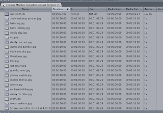
 In order to even start making the evaluation on final cut
pro I had to ensure that this part of the outcome was covered so that I knew that
the correct visuals as well as audios were imported and this worked well once I
had gasped the nature of the programme. To complete this process I had to click
on one of the tool on the main toolbar and import from the desktop. The items
that were imported included the images that I sourced online of some of the
existing products in which I analysed along with the use of the opening title
sequence that we actually produced and then I had to also import the soundings.
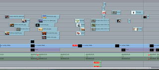
 This screenshot is of the timeline in which is where it could
move certain parts of the clip. I had to use this a lot as it had to be used
after transitions or movement to make sure that the audio and visuals were
formatted by rendering them which did become rather time consuming but ensured
that the actual final product when exported was correct which was a good idea. It
also meant that when I missed out one of the questions that I could then go
back into that outcome, and then from this make sure that the correct or
misplaced question was added; therefore, this tool as it meant that mistakes
became easy to rectify.
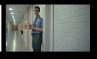
This visual was the foundation of the evaluation as it meant
that the primary source of what I was evaluating was actually being seen; this
would be good for the examiner or consumer as it would mean that direct comparisons
are evident and this would mean that the item would be much easy to evaluate. I
made sure that the opening title sequence was seen the whole through the outcome
as this is the purpose of the evaluation.
Overall, I think that the evaluation was successful so far
and fits the brief of the interactive nature as it does not quite abide by a
normal word document which is a good idea. The use of final cut pro was a good
idea as it meant that there was more chance of masking the product as
sophisticated as it could be. The use of the Chroma key tool was the hardest
tool to use on the programme as it was a matter of trying to replicate the used
Chroma -key on all so that it was the same the whole way through.
No comments:
Post a Comment