Showing posts with label Analysis. Show all posts

Wednesday, 30 January 2013

Titles and Transitions

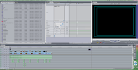
Today, we actually started to add the transitions and the titles for the opening title sequence which I am really happy about as, it finally means that we can get an actual overall idea of what the sequence is going to look like overall rather than just the edit by itself, it also gave me and Daisy a real chance to put our ides into the edit which I was really enthused about as it is the concept of something new. The screen shot on the left shows that I started to add the fonts, following will be the process in which was endured for this process.
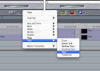
This is actually the first step which we was helped with by Jack as we asked Jack how to do the proceed conducting it in a certain manner and Jack told us, we made notes meaning we could do it ourselves when we started. To get to this screenshot you basically, open a bottom make A and then from this there is a drop down menu which you would click text and test again to start adding the text. This step was rather easy to get to as it is accessible and the buttons be seen clearly as they are bold.


This screenshot shows one of the windows in which will occur after the technique of the first step. It here allows you type the text in which needs to appear on the frame making it very manageable by the person in control on the mouse. There is also other techniques within this window in which you can control and this includes changing the size in which I did a lot to get the right sizing and the sizing of the font was for the smaller credits it was 27 and for the larger credits and basically it was the main titles which was 48. Therefore, this helps to emphasise that the most important thing is the main titles. You, can also like we did change the colours of the fonts meaning that there is a colour spectrum but this was rather easy as we already as a group decided that the white was our number one preference.
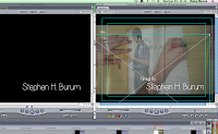
This screenshot shows here how you can move the font and therefore pick a placement of the font. To be honest Daisy picked the placement which was absolutely, fine as we worked as a team us me doing the fonts and Daisy the movement of the fonts onto the screen as I applied the positioning of the fonts. To move the fonts you have to make sure that you have the x framing on the font and to move you click on the middle and move the font within the frame. This was rather easy to move but at stages there was complications as the x frame sometimes was not clicked.


The most annoying and time consuming part about the opening title sequence and the adding the titles was having to render practically after every piece of movement and new effect added which did become rather frustrating at times as it meant that what we could have done in an hour and a half turn into two and a half hours.
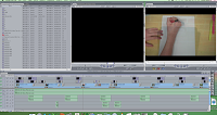

This screen shot is showing basically that I prior before moving the fonts and doing the placement and size, I made them as it meant that I could then do lots of fonts consecutively meaning they would all work well together and also meaning that in one run I could get it done as I would be following the same process.
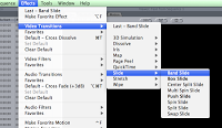
This is the start of the transitions in which Daisy completed and this was more of a trial and improvement type of steps and Daisy thoughoully analysed each type of effect seeing if it actually worked alongside all of the opening title sequences that already existed. To do this it was basically a matter of clicking on the effects on the main bar at the top and then under transitions on video Daisy chose to pick one in which was branded Band Slide which was a transition in which was a slide across the screen looking really much like the analysed ones in which we looked at thus replicating our genre very well thereof ea. think it fits the conventions of the genre.
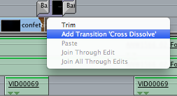


This is the last sort of transitions and these were only applied to the smaller titles as the band slide appeared on the main titles. Personally, I feel that it was a good idea to do a transition of both of the fonts as with one it looked rather odd as if one font was supposed to stay. The use of the cross dissolve gave this sophistic approach to the tieless thus making it look far more professional therefore, it could be considered and referred to as being more of an existing opening title sequence in the film industry.


Thursday, 24 January 2013

Importing from Photoshop to Final Cut pro.


This is screenshot is showing how to import in quick terms it is basically a process in which supervision can be required as, it is a long and time consuming process trying to do it by yourself if you are a beginner thus me needing the supervision of a technical assistant at school.
In honesty, I am still rather confused by this process but, I don’t really need to capture this process as Jack the technician has told me that it can be edited upon straight away on final cut pro thus meaning that it is less time consuming and works better as you can see it straight away and improve by comparing and contrasting to other opening title sequence. He advised me not to use Photoshop documents and import unless I am trying to create something in which final cut pro cannot create on itself. For example, Chroma keying the green screen on after effects.

So, if correct to get to this process you have to fame the font creating these parallel line both horizontal and landscape and then import the file via putting it on to Final cut pro. Which sound rather easy but would take a very long time if I was to do this one by one?

Tuesday, 22 January 2013

Font Colours


I am going to now conduct some research into what the font colour should look like so that as a group we can start to choose what font colour to choose. In terms of, what colour I am going to choose I will conduct the research on a basis of what font colour what best for me in preference and I will do this six times then refer the data back to my group and other people asking them what they think of the work produced from this I will then write up a data and complete a tally chart. Once I then, have the correct data for my work I will then apply this font colour to all titles produced. I am going to conduct the font colours on Photoshop.
This is a screenshot in which shows that I have used the programming deceive of Photoshop for to infill colour on the font. The shot shows that so far I have conducted three colours starting with: orange, dark blue and then green. I have also prepared three more templates to put the fonts onto so that I could experiment with some more colours. As, you can see from the screenshot I have followed the same principle with all three of the templates in being that the shadow is still evident as, I feel that it gives it this sophisticated look although, it may not show up if we choose to preference the background colour of black.


This screenshot is showing in which the final fonts from this screenshot I quickly looked to see if any mistakes would need rectifying. This also helped me to compare and contrast the fonts in terms of whether I actually liked them or whether there was something missing that there wasn't with the other font necessarily thus meaning that I could focus upon a certain amount of consistency in the fonts and that the preference would purely be based upon the font colour and no other possible attributes such as the shadowing on one of the fonts or the missing pieces of the paint on one of the titles.


Once, I had observed to see if there was any mistakes or missing editing skills on the fonts I chose to show the fonts to my group and I personally feel that they was rather happy with the decisive decision to start doing the font colours and they said that there was some great colours and some not so necessarily great but, I feel that carrying out and conducting a set of research will be the best way to choose a font. This will show that our decision is more representative of our market and not one sided meaning that if we ask a lot of people the demographical audience could possibly widen making our film more of a box office success.

Friday, 18 January 2013

After effects

What is after effects?                                                                                                                                                                         After effects is a programming device created by Adobe which is used in post-production to create film-making and television production. It helps to colour adjust video and photo based work as well as adjustments for the placing on a frame.
The reason that we have started to consider using a device such as after effects is because we now have to consider looking at getting rid of the green screen in the background to start replacing it with different images or to just have a black background; both of which could work. Although, this role is for Louise we did all complete as a group one lesson on after affects which our teacher. The group consisted of just our group.
Why did we use the green screen for this scene? We used the green screen for this scene as a phone is rather small so having any background or setting at the back of the phone would have actually distracted from the phone, which is what we didn't want to happen as, it would mean the title would be rejected by the demographic. The other reason is that a phone in a "spy" film is considered a large iconographical item as it means that it gives the impression if a good job, organisational skills as well as the idea of contacts and secrecy.

The scene in which we was planning to apply the green screen tracking to was the phone scene as, we need to get rid of the background so that it no longer shows the green in the background as, it is devising from the phone. So, below I have described the process at the bottom in which I followed along with my group to get rid of the green screen making it look much more sophisticated:

Stage 1- Getting on the programme on the computer- This is a screen shot of after effects used on the Macintosh computers. To get to this stage, we basically clicked on the icon and then let it load agreeing to programme. We, then was advised by our teacher that we had to get a scene ready to use and we all agreed the first scene to test after effects has to be the phone scene; the first scene of our opening title sequence. On first sight it was slightly daunting the image of the left as there is a lot of skills to know to be able to use the programme successfully.
Stage 2- Importing the file to get it ready to start working on- Our next step was learning to upload the file to the programme to start working on. This was done by a toolbar. Basically, we had to import the files onto the programme via file- then import and then clicking on the correct folder which was just a matter of time by, looking through desktop as well as user name. Once the file loaded we knew it was almost time to work on.

Stage 3- starting to work on the document on after effects- To do this it was just about using a key light editing skill to get rid of the green by selecting the section in which we wanted to remove. We then, had to adjust the toning levels so, that the black was dark and the white was clear. This helped to ensure that there was a clarity to the work as, we needed to do this to make sure that the lines was clear and concise demonstrating that it would look more professional; as doing this avoid those pixels around the edges of the work which may appear if not adjusted correctly. This basically gave that professional look and it was now about getting it ready to put as a video which we uploaded to YouTube.
Below, is a clip labelled AE test this clip shows the first process on after effects there is a phone which is black. The special effects worked rather well showing how the explosion worked and I was rather satisfied with the first draft. I do feel that clip shows the phone in an explosion successfully, but after deliberation we did decide that in a way the black phone does not work that well as for one it doesn't show the clarity of the phone and there is not the decisive background as, they are both black. So we planned to re-film with a white phone repeating the process to improve.


The second filming-This image below shows an image of the repeated process and shows straight away that the clip is so much more better in terms of filming as there is the item in far more focus then the first filming of the phone. The white phone shows a great deal more of clarity as it shows the contrast in the white and black and this means that the lines are very clear and straight; the pixels are perfect no green pixels have been left from the green screen.

Thursday, 17 January 2013

Order of our titles


The order of our titles has been decided and the reason that i am posting this is because I need to produce the actual font for the opening title sequence with the fonts. I plan to produce the font quite quickly so that it can be worked on in terms of colour and the sizing. 

The order of the titles that we have decided to follow is. This was decided quite a few months ago when doing the storyboards process so that we could base our filming on the real order of the titles.
The order of our actual titles is: studio name, Production company, starring..(Actor), featuring, then the casting, music, editor story by and director.

I plan to with the upcoming weeks to produce the entire font via the programming device of dafont so that it will be ready to put onto the opening title sequence and be prepared for the font sizing and the colour. I plan to make a post on some colours that could be considered for the font to see if they would work. The sizing will be placed after this so that i can see how big the screen is to work


Tuesday, 15 January 2013

Analysis of some existing fonts in the same genre

 I am going to look at some existing fonts of the same genre and then analysis these pieces to see if they can help me to conduct our research.

 English reborn-The font for Johnny English replicates the font produced from a typewriter. The placing is easy to see but, not too large that it distracts from the imagery and the placement of intersecting lines which in the frame. The font looks so very much like a mission. The fact that the font has this certain typewriter feel makes it seem rather professional giving the thematic of humor- hinting that this may be in the film. The fact that the font is the middle of the screen gives the impression that the text is of the same importance as the audience. The font is mainly in white which works well on the frame as, it works consistently at making it look like black and white which works cohesively at indicating that the film may have a narrative that fits contextually with the spy genre.

 Pink Panther 1996- This font works very consistently at giving the impression that there is a an ever-growing colour of pink. The font works well because there is a certain element of simplicity as there is just one picture and then there is a name. The fact that there are very minimal elements on the screen means that there is this assurance that the audience will be likely to be focused upon the actual font and image as there is not lots of tangents distracting certain elements. The fact that the font is the same size as the image indicates that both items are just as relevant on the frame; something which i plan to conduct some research upon.

Mission Impossible- This font is rather consistent and shows that the producer is a large piece of information and should be regarded as really important to the film because the placement is in the middle of the screen with no distracting information. The fact that the font is Sans- serif gives it an element of sophistication to the film suggesting that the audience is rather older. The fact that there is a black and white concept for the font makes it seem. The fact there is a transition in terms of fonts going over the top of existent fonts makes it seem very clear and concise re-alliterating that the information is really relevant and makes it look very swarve replicating a chase on its entrance to the screen as it uses instruments such as pianos.

Thursday, 10 January 2013

Youtube Tracking of the Green Screens


The YouTube clip on tracking of green screens and how it will help us:

Today, we watched a clip off of YouTube which was recommended by our teacher when we had mentioned that we have used a rather lot of green screening in our shots. Our teacher has mentioned that we will have to obviously source some sort of footage that will replace the green and it is now just about making sure this is sourced and planned appropriately in the upcoming lessons.

This clip helped to highlight some key issues :

-

Tuesday, 1 January 2013

Continuity analysis: 180 Degree rule


180 degree rule
This video I also sourced online from YouTube helped to give another sense of continuity. THz rule distinguishes that the camera is the viewer’s eyes and that you have to have those smooth transitions in order to keep that sense of continuity on a 180 degree line.

The video points out that we as the viewer have to be on one side of the character and that we should therefore only show one side of the characters. The video points out that we should only see from one side as moving from one shoulder shot and seeing from the left character on their left side and then seeing from the right character on their left side would cause distraction. This highlighted when the characters look into each other’s eyes and it gives this sense of movement from the eyes. Moreover, making the mistake would make the frame look undistinguished and wrong so keeping on that one side adds fluidity and movement without distracting from what we have seen.

The clip makes it seem easy to distinguish if the rule has been disobeyed as the setting will most likely change on both sides and so will the facial shaping. The male speaking also points out that if the rule has to be broken the camera must film the rule being broken so the audience can indirectly distinguish the movement of the camera. If and when this happens it has to also follow the same notion on the other side.

This rule will be hard to break within our shot as, we are filming small narrative parts but, we will hopefully with the knowledge learnt from this clip be advised on how to obey the rule if unsure when in the filming process.

Continuity analysis: Match on action


Match on action
I sourced  a clip form YouTube to help me get some more contextual knowledge into the field of continuity and how not to lose substance of our opening sequence by disobeying the rule. Match on action is the idea of revolving around one feting by keeping a cohesive sense of fluidity in the opening title sequence.

Within this clip which is revolved around a book it shows that the book is the consistent item within the frame at all times; meaning that there is no distraction form the action of the shot. This example shows an element of fluidity and movement. The camera moves from shot to shot with keeping the book in the screen. Therefore, it adds this sense of cohesion as, if there is only one shot when in reality it has been multiply shot.

The fact that the female is within the shot at all times gives the sense of familiarity towards the audience and the lady indicating that it is just the female reading; and that no other characters are within set. Iconography elements help to hint that the female is in the scene throughout, her bracelet is within the mid-shot as well as the close-up which helps to portray that it is only one character reading. The setting is in a library adding a sense of continuity as this is the most likely setting for a book.

This clip has helped me in the sense that now I can give a sense of knowledge in this rule as I now know that there has been a series of multiple shots for the action to seem cohesive and jumping from one part of the action will create a unsmooth transition. I also know that keeping an iconographical or costuming piece within display helps to advise that the same character is doing the same actions throughout.

The knowledge that I have distinguished from the clip will be helpful for me but, not just me in importance it will help the cinematographer as, they will need the knowledge of knowing how to film the rule in terms of how many shots to use and how to make the smooth transition from frame to frame.

Sunday, 30 December 2012

The two main types of font

There are two main types of fonts and we discussed them within a lesson.
They consist of ; Serif and Sans serif.

The two main types of font are highly endorsed within the handrwriting world but, within technology the main type or more rather the font in which is largely incorporated is Serif.

Serif is basically Sans serif with decorative ends onto the bottom of the lettering which is used to add a sense of decoration to the handwriting making it look rather italic. The sense of making the font look italic makes it look more sophisticated as well as professional.

Within technology it is evident that Serif is commonly used; this is evident on this font and this font is automatically the preferrence. The image belows shows in imagery what is meant by the discription above:

 The image to the left basically showss the difference between the fonts and how they are peceived by us the consumer, it clearly shows that Sans Serif is less rounded and has this sense of geometric lines overlapping eachother to actually create lettering. But, serif has the more professional look which would have dated back when italic was endorsed. The fonts are usually used in the main type of font colour which is black.

Sunday, 16 December 2012

Catch me if you can analysis (typography)


The film for me straight away triggered a connection towards the series of be-witched which had the same style of music as well as the slight geometrical shavings in which the be-witched opener had. I suppose the style of transition of the titles flying in and moving into the screen - the flying of the lines emulated the flying of the witch of the broom which was my initial reaction. The transitions was very smooth and classy which had the impression that the film was going to sophisticated, possibly even a hint of what the audience profiling would be like.
The characters held the iconography which gave the impression that there was once again this occurring thematic of sophistication and possibly a sense of ambiguity into the actual career the protagonist embodies throughout the film.

The typography of the title "Catch me if you can" gave once again this fluid sense of continuity and cohesion of the opening title sequence. The lexis "me" was in a font which embodied the style of a cloud giving the impression that plane movement and transport is to occur within the film possibly even a chase between rivals. It also gave the impression of lightness a sense of a hidden identity possibly as the cloud was almost merging with the blue sky background.

The stylish feel of the film slight reinforced that the characters was likely to be chic and at the top of the field of profession they enrolled in which was also, indicated through the jazz music which is usually associated with the 60's and meeting a lady in which was likely to become an equated female in the future. This narrative was touched upon when it evidently had the scene in which had a man enter a black room full of women around the side. The fact that the scene was lack once again touched upon the thematic of secrecy in the film. This referenced the theory by Laura Mulley and the Male gaze as, the females although ''cartoon-like'' had short pink dresses on suggesting that the purpose was to catch males attention.

There was an obvious influence within the film and it has to be Saul Bass. Bass's famous hallmarks which are evident in his work seemed to be there: the geometrical shapes placed in the formation of characters was evident and emulated the opening title sequence Bass made for Vertigo. Other attributes which gave the indication that Bass's work had influenced the making process, the colour choice hinted this as they were blues, reds and oranges.

The opening title sequence also incorporated the two types of font. Sans Serif and serif. Serif was present on the word ''present'' and sans serif was evident on the other entire font giving a continuous and cohesive feel to the opening title sequence.

The movement of the font and the fact that it came in slowly and gracefully gave the impression that a chase is to occur-it slightly referenced the Pink Panther opening title sequence. The lines looked like a ''type-writer'' sensing that it might be an iconographical aspect and backing up the contextual era of the 60's.

Wednesday, 28 November 2012

Analysis of the Foley sounding and recoring of the fight sequence.


This is our group fight scene. The ambition of the task was to produce a fight scene in which would have conventions in the film industry. So, to begin with we had to fill each member within our group with a role and me and Nicola was chosen as actors, Louise as the filmed and Claire helped us by creating sound effects at first. We, chose the narrative by group discussion and the chosen narrative: a youth in which was scary would attack a old grannie to try and rob her shopping which worked quite well as, it had the realism that would in turn be familiar and not so shocking within society as, the papers have similar stories.

Once, we finished shooting it was all a matter of time in which we had to edit, this was done on the apple macs so that we could source programmed such as, iMovie. We, choose to use iMovie as, we felt more confident with this programmed and this would therefore, produce a better outcome if we thought it did. Then, we finished shooting and had to present to the class. We then, as a class was told that we had to create Foley sounding for the fight scene with the food that he sourced which was vegetables, meat and nuts. With all the items we used we practiced so that the best outcome would be produced. Celery sticks implicated the sound of broken bones. Nuts cracking for a sense of cracking noises and bone movement.

Some of the Foley sounding sequence events that we did have to make and invent the so included: Picking up the shopping bag, snapping bones, opening a door, answering a mobile phone and walking down a corridor with no noise.
When creating some of the noises it can be suggested that we learnt it was a great help to have the footage available for viewing as, we could then view it whilst making the noise, which meant that the timing was perfected. This also meant that we could alternate as,  we could view before making the noise which meant that each noise was less time consuming. I felt that this added and adapted our organizational skills; meaning that we worked much better as a group as, it gave us direction.
\
One could consider, that mixing two noises together gave a great outcome as, it added to noise effect meaning that it made the noise seem more cohesive to the footage, this was visible through the fight scenes such as, mixing meat slaps and crunching nut shells gave a realistic falling sound to hit the floor. This meant that those less indirect actions that maybe not noticed until the reviewing stage could have those background Foley soundings to make the fight look real and continues instead of an alternative of stop and go.

Previous to the Foley sounding we did improvise by making sounds. Claire made sounds for the fight scene in which turnt out rather well. Although, the sounds produced was good we did choose to use the vegetables to see how it could turn out; especially if we took this avenue within our own opening title sequence.

The editing process was completed on Final Cut; Nicola and Daisy completed most of the editing of the Foley soundtrack, which turned out rather well. We completed most of the sounds within the lesson which helped as, it meant most of the Foley sound could also be finished within that time and it re-shooting/sounding needed to occur we could time manage well.

Overall, I basically learnt some skills that will hopefully help us as a group to produce a great opening title sequence. The skills in which I learnt include: learning to work betters a team more cohesively, shooting skills as well as being able to film. In summary, I would say that what we produced worked well and if an opening title sequence with a fight scene as, a convention would be covered.

Monday, 12 November 2012

The Game

(Image of the Game)

In Class Analysis of the opening title sequence for the game-

Style-
-Classical music makes it seem like the pace and flow is gradually the same throughout.
-The piano builds tension creating a sense of secrecy and that someone is going to get killed, as it seems that the climax is waiting to occur.
-Old fashion shots are juxtaposed by the ending of a modern society.
-The puzzle at the beginning breaks and looks like metal an indication of wealth.

Settings-
When? 1960's-1970's indication through the old images but could be an old memory through the change in setting.
-The beggining juxtaposes the end, old vs. new and city vs. countryside.
-Suggestion of someone’s house via the door entrance, the swimming pool and the wedding in an almost looking garden.

Thematic-
-Family descent, through the use of the walking away from the child.
-Innocence, the child seems corrupted by the dad’s loss of interest.
-Family disruption
-Evil
-Loneliness, no one seems to care for the child, he seems to be lonesome.
-Rich and wealthy. Through the indication of the house size etc.
-Identity, the dad seems to be hidden almost like he is hiding something.

Iconography-
-House holds secrets.
-Birthday cake, celebration, which doesn’t seem to be joyous for the child as the much needed attention the child desires seems to be abandoned.
-Old photo style much like a picture suggests something has happened to the child (died or kidnapped).
-Boat- the father gives the son a boat a suggestion that there is a divide and that dad wants to make it or him float away much like the boats purpose.

Narrative-
-Puzzle at the beginning of the title sequence suggests, that something is missing the main actors life and throughout the story that desired gap will become filled.
-The doorstep seems an upfront persona that he really doesn’t love his child but pretends to around people.
-The child may want revenge for being swept aside.