I am going to look at some
existing fonts of the same genre and then analysis these pieces to see if they
can help me to conduct our research.
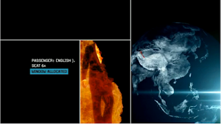
 English reborn-The font for Johnny English replicates the font
produced from a typewriter. The placing is easy to see but, not too large that
it distracts from the imagery and the placement of intersecting
lines which in the frame. The font looks so very much like a mission. The fact
that the font has this certain typewriter feel makes it seem rather
professional giving the thematic of humor- hinting that this may be in the film.
The fact that the font is the middle of the screen gives the impression that
the text is of the same importance as the audience. The font is mainly in white
which works well on the frame as, it works consistently at making it look like
black and white which works cohesively at indicating that the film may have a
narrative that fits contextually with the spy genre.
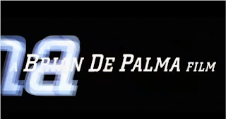
 Mission Impossible- This font is rather consistent and shows that the
producer is a large piece of information and should be regarded as really
important to the film because the placement is in the middle of the screen with
no distracting information. The fact that the font is Sans- serif gives it an
element of sophistication to the film suggesting that the audience is rather older.
The fact that there is a black and white concept for the font makes it seem. The
fact there is a transition in terms of fonts going over the top of existent
fonts makes it seem very clear and concise re-alliterating that the information
is really relevant and makes it look very swarve replicating a chase on its
entrance to the screen as it uses instruments such as pianos.
Hello :) You said you wanted to know what to do next,you are very far ahead so you don't have much left to do. All I can say is that you experiment with the scale of the font and the colour as most of our sequence is on a black background therefore we cant have the font being black so this could be something you should consider.:)
ReplyDelete