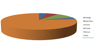
I have conducted a set of research to find out which font in
which the public found was there preference. Philosophically, I like the colour
red. From the research in which I conducted in the process of describing myself
in a short brief of what the film was about the narrative and the main thematic
of the film. I suppose that I had to this as it was slight inevitable to ask
someone to make a judgement without the contextual knowledge of the film.
I just put the titles on a sheet and with a tally chart in
which I made on word and then I just asked people of their preference out of
the six with the brief description. The vote was purely on the basis of one
vote per person as doing a more democratically approach of asking the first to
third preference would have been likely to be rather time consuming and hard to
distinguish the actual preference. I asked a total of 50 people just to make
sure that the results was fair and showed a clear favourite thus meaning that
the majority would have appealed to a larger audience.
The clear favourite was the red thankfully for me in
extremely content with the decision as the red has an underlying connotation of
love as well as anger which ironically is what our whole film revolves around.
The red was also the easiest to produce on the document a she black original font
was easy to distinguish the blemishes of the font so; therefore I could easily
use the paint bucket tool to hide these blemishes.
From the results now I will add the red to the smaller
titles and see if this works within these titles as well just to make sure that
there is this consistency and cohesion within the work as the font colour has
to work the same for both of the titles for the reason that it is meant to
replicate an existing opening title sequence. In addition, all the opening
title sequences that I looked at I found out that there is this one consistent
colour and it flows as one and that the exception of using two font colours is
mainly preference in the animation industry.
I am now going to apply this font colour to the smaller
titles and evaluate this and then I will then look at applying this red colour
font to all of the other titles which I hope will then, be ready for Daisy to
produce the transition for the fonts on the frame.
The chosen font colour-

No comments:
Post a Comment