 Today, we actually started to add the transitions and the
titles for the opening title sequence which I am really happy about as, it
finally means that we can get an actual overall idea of what the sequence is
going to look like overall rather than just the edit by itself, it also gave me
and Daisy a real chance to put our ides into the edit which I was really
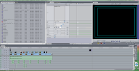
enthused about as it is the concept of something new. The screen shot on the
left shows that I started to add the fonts, following will be the process in which
was endured for this process.
Today, we actually started to add the transitions and the
titles for the opening title sequence which I am really happy about as, it
finally means that we can get an actual overall idea of what the sequence is
going to look like overall rather than just the edit by itself, it also gave me
and Daisy a real chance to put our ides into the edit which I was really
enthused about as it is the concept of something new. The screen shot on the
left shows that I started to add the fonts, following will be the process in which
was endured for this process.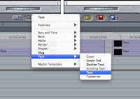 This is actually the first step which we was helped with by
Jack as we asked Jack how to do the proceed conducting it in a certain manner
and Jack told us, we made notes meaning we could do it ourselves when we
started. To get to this screenshot you basically, open a bottom make A and then
from this there is a drop down menu which you would click text and test again
to start adding the text. This step was rather easy to get to as it is accessible
and the buttons be seen clearly as they are bold.
This is actually the first step which we was helped with by
Jack as we asked Jack how to do the proceed conducting it in a certain manner
and Jack told us, we made notes meaning we could do it ourselves when we
started. To get to this screenshot you basically, open a bottom make A and then
from this there is a drop down menu which you would click text and test again
to start adding the text. This step was rather easy to get to as it is accessible
and the buttons be seen clearly as they are bold.
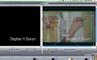
This screenshot shows one of the windows in which will occur after the technique of the first step. It here allows you type the text in which needs to appear on the frame making it very manageable by the person in control on the mouse. There is also other techniques within this window in which you can control and this includes changing the size in which I did a lot to get the right sizing and the sizing of the font was for the smaller credits it was 27 and for the larger credits and basically it was the main titles which was 48. Therefore, this helps to emphasise that the most important thing is the main titles. You, can also like we did change the colours of the fonts meaning that there is a colour spectrum but this was rather easy as we already as a group decided that the white was our number one preference.
 This screenshot shows here how you can move the font and
therefore pick a placement of the font. To be honest Daisy picked the placement
which was absolutely, fine as we worked as a team us me doing the fonts and Daisy
the movement of the fonts onto the screen as I applied the positioning of the
fonts. To move the fonts you have to make sure that you have the x framing on
the font and to move you click on the middle and move the font within the
frame. This was rather easy to move but at stages there was complications as
the x frame sometimes was not clicked.
This screenshot shows here how you can move the font and
therefore pick a placement of the font. To be honest Daisy picked the placement
which was absolutely, fine as we worked as a team us me doing the fonts and Daisy
the movement of the fonts onto the screen as I applied the positioning of the
fonts. To move the fonts you have to make sure that you have the x framing on
the font and to move you click on the middle and move the font within the
frame. This was rather easy to move but at stages there was complications as
the x frame sometimes was not clicked.
The most annoying and time consuming part about the opening title sequence and the adding the titles was having to render practically after every piece of movement and new effect added which did become rather frustrating at times as it meant that what we could have done in an hour and a half turn into two and a half hours.
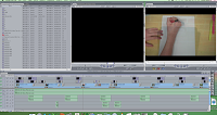
This screen shot is showing basically that I prior before moving the fonts and doing the placement and size, I made them as it meant that I could then do lots of fonts consecutively meaning they would all work well together and also meaning that in one run I could get it done as I would be following the same process.
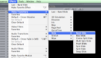 This is the start of the transitions in which Daisy
completed and this was more of a trial and improvement type of steps and Daisy
thoughoully analysed each type of effect seeing if it actually worked alongside
all of the opening title sequences that already existed. To do this it was
basically a matter of clicking on the effects on the main bar at the top and
then under transitions on video Daisy chose to pick one in which was branded
Band Slide which was a transition in which was a slide across the screen
looking really much like the analysed ones in which we looked at thus
replicating our genre very well thereof ea. think it fits the conventions of
the genre.
This is the start of the transitions in which Daisy
completed and this was more of a trial and improvement type of steps and Daisy
thoughoully analysed each type of effect seeing if it actually worked alongside
all of the opening title sequences that already existed. To do this it was
basically a matter of clicking on the effects on the main bar at the top and
then under transitions on video Daisy chose to pick one in which was branded
Band Slide which was a transition in which was a slide across the screen
looking really much like the analysed ones in which we looked at thus
replicating our genre very well thereof ea. think it fits the conventions of
the genre.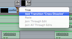
This is the last sort of transitions and these were only applied to the smaller titles as the band slide appeared on the main titles. Personally, I feel that it was a good idea to do a transition of both of the fonts as with one it looked rather odd as if one font was supposed to stay. The use of the cross dissolve gave this sophistic approach to the tieless thus making it look far more professional therefore, it could be considered and referred to as being more of an existing opening title sequence in the film industry.
No comments:
Post a Comment