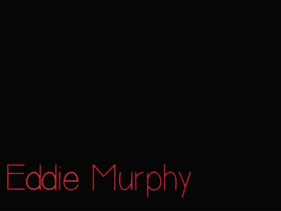
We gave deiced to go back
to original font design except this time I have tried to get rid of the font
shadowing which was the primary concern of the font. This time there was
completely different process with this font I had to download the font; to do this
I went onto dafont.com and then downloaded the font and this went onto a
downloading bar in which I clicked and then used via going onto Photoshop
elements in which it downloaded thus making the font less pixelated and far ore
accessible for the group and me.
Once the font was
downloaded I just used the paint bucket tool and this gave the black background,
which made it look continuous with most of the black backgrounds applied by
Louise. I then just clicked onto the T, which symbolizes the text tool. With
the text tool I then used both of the preloaded fonts was just a click away
from finishing. With this I then did the titles for just the main font using
simplicity.
To get the more stylistic
approach without the worry of the white shadowing I just used the paint bucket
tool to get rid of the shadowing which meant that I could made the white
shadowy pixels black thus looking more professional and cohesive with the
original and existing font.
I do I have a problem with
this font though as it is still fairly pixelated so we are now talking about
making the font white as it will be so much better in terms with the black background
we also have acknowledged that the font is rather horror like; which would be a
false impression of the film to the demographic thus my next step will be to
get a white font. The white font would also
have more connection in terms of the narrative and the thematic of the film.
No comments:
Post a Comment