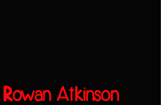
To create, this mock-up of
the fonts I basically made this on Photoshop using the same programming device
of dafont and put this font onto a blank file. I then just put this
existing font onto the file using the same process of putting the red onto the
title using the paint bucket tool which filled it with colour thus giving it
this impressionable look and making it rather clear. So far i have this
percolation that the font is rather hard to distinguish what the actual font
was like thus reading really hard. I feel that I would defiantly try to make
the font far more distinguishable by putting it on the same background and
exploring some options. The routes that I could possibly explore with this font
could possibly be making the font thicker or possibly removing some of the
white shadowing which might be distracting the original.
I have basically here
improved the font to some extent and it has to an extent improved but I think
that I still preference the above font more as it looks clear and precise. To
make this font I basically just paint bucketed the font to make it look far more
distinguishable. The trouble or in a way the disadvantage with this font is
that it is very pixelated and doesn't look at professional as, I wanted it too.
I have showed this series
of exploration to my group and as a decision we decided that the shadowing font
looks so much more precise and clear- it also has this professional look as the
shadowing looks worked upon and the other option is too childish making it look
naive and not as nice and clear about this. I now plan to try and add this
exploration to the smaller titles and this would therefore show a sense of
cohesion and will help me as the titles manager to make the decision if it
flows cohesively as one piece.

Fonts are looking great, good job :)
ReplyDelete