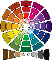
Font Colour for Mr Teddy
Connotations of colour
 he colour red comes across as being rather dangerous and
creating a sense of anger. It also connotes: blood, love, stop, patriotic,
evil, mars and horror. Moreover, it is suggestive that we was not going to use
the colour red as red is very much associated with violence being the primary
theme were as ours is humour.
The colour yellow is this sense of happiness as a thematic
possibly the underlying reason is the sun relating to weather and our mood
towards heat. It also connotes: waiting from traffic lights, brightness, and
intelligence and cowardly. Therefore, we decided that this would not really
give the sense of an action film within was revolving around being heroic; not
cowardly.
The colour green is very much a colour that is neutral, to
me meaning very countryside or tropical. It also connotes the ideas and thematic
of: nature, saving, envy, go, wealth, ill, conserve and medical practices. We
decided not to choose this colour as the tropical countryside location doesn’t really
fit with our setting as, we wanted this element of the city and an office.
The colour blue was also considered and this colour
connotes: coldness, conservatism, boys, depression, mentality and cleanliness.
This colour was not fitting for our film as, for me it adds this sense of water
within the narrative almost sensing that the sea will appear in the film which
it doesn’t so for that purpose blue was decided that it would not fit our film.
Purple was also considered for the font colouring. It came
across as being expected to be seen as a font for a superhero series because of
the connection to the colour of crystals so, therefore the colour purple which
had the connotations of: Cadburys, passion and witchcraft was dismissed.
Brown was also dismissed because of the connection to the
toilet but, it did also have the connotation towards something that gets in
your way which we classed as interesting as our film is about obstacles. The
colour pink was dismissed straight away as it had too much of a connection
towards girls and we wanted to appeal towards a mass audience rather than a
small grouping in society.
White and grey was both also considered but we choose not to
go with white because it connoted: purity, doves, peace, innocence, birth,
ghosts and health. In a way it had too many connotations to be completely sure
whether to use it. Grey was not used also as it connoted: ambiguity and fog so,
seemed rather boring for the audience we wanted to appeal to.
The final colour in which we looked at was black and it was
our chosen colour as it had the connotations of: darkness, loneliness, a
funeral and a hidden identity. Therefore the colour would fit that narrative as
well as thematic in our film. The sense of black being a colour relating to a
funeral would mean it would fit the grannies death at the start of the
narrative. It also fit iconographical pieces inn our film such as the expected
black tuxedo and briefcase within a “spy” film.
No comments:
Post a Comment